


Viva Magenta: What Does Pantone Color Of The Year Say About 2023
Photo: Estrop/Getty Images.
Ahead of Pantone's 2023 Color of the Year announcement, I suspected pink was on the horizon. After Barbiecore dominated the better part of our lives and closets in 2022, there was an inkling that the color forecasting company would choose a rosy hue. Yet Viva Magenta, revealed on December 1 as the official choice, was still a surprise.
It’s not the baby pink of rose quartz crystals and the Millennial wellness industry, nor is it the shocking pink of Elsa Schiaparelli and Planned Parenthood that has taken over fashion as of late thanks to Valentino's viral show. It is not as mauve as a true fuchsia, not as orange as scarlet, and not as primary as Pantone’s Period, a shade that looks more like a fire engine than actual menstrual blood. It’s much richer than the flat medicinal pink of Barbie’s dream house (a color now offered by pricey paint company Backdrop). Viva Magenta is more complicated than those hues. I’m not even sure if I think it’s pink.
AdvertisementADVERTISEMENT
“[Viva Magenta] is both powerful and empowering,” says Lee Eiseman, executive director of the Pantone Color Institute. According to the examples provided by the company during the virtual press preview — featuring runway shots from Loewe, Gucci, Thom Browne, and Dior fashion shows — the color is crimson red, hot pink, fuchsia, raspberry, and maroon, all at once. It’s flowery and natural, but it’s also slick and shiny, just as good for lipstick and clothing as sports cars and cell phones. (The latter is confirmed when, toward the end of the presentation, Pantone’s reps revealed that their brand partner Motorola is planning to release a Viva Magenta phone.)
It’s the color my lips turn when I slick on Lipstick Queen’s Frog Prince, a color-changing makeup that looks green but transforms (thanks to pH-reactive Red 27) into a raspberry popsicle stain upon contact. It’s part Rothko Red, part Moulin Rouge, well, rouge, a red that plays incredibly well with scarlet and fire engine and hot pink but also looks at home next to pastels like periwinkle, lilac, and baby blue due to the color’s cool purple undertones and slight transparency.
Laurie Pressman, vice president of the Pantone Color Institute, says that cochineal beetles served as a historical source for this “hybrid color.” These small bugs, native to parts of North and South America, get their coloring from feeding on prickly pear cactuses. When ground into a paste, their bodies can be used to impart a vivid red pigment onto paper, canvas, or clothing. The dye was first used by the indigenous people of Mesoamerica (according to BCC, it dates back to 2000 BEC) who used the potent coloring for purposes both aesthetic (dyeing clothes, tinting teeth) and medicinal. According to accounts from Spanish conquistadors, the Aztec red was so impressive that some speculated it might have magical properties.
AdvertisementADVERTISEMENT
These days, the primary use for the bug-derived color is in food and makeup — it’s a substance you’ll ingest if you like cherry candy or tinted balms — though there are sought-after artisans who carry on the centuries-old practice of dyeing clothing using the traditional method. Vibrant color aside, what’s most interesting about cochineal is that, like all plant- and bug-derived colors, the color can change wildly based on the garment and the treatment. While it makes it hard to mass produce clothing — for his Spring 2022 show, Jason Wu hand-sponged cochineal extract onto the collection with the help of a fabric artist — it does create striking, one-of-a-kind pieces. (I’ve dabbled in natural dyeing myself, and the variation is precisely what I like about it.) There’s room for exploration with colors like this, space created for playful mistakes and happy accidents. There’s an intimacy to all handmade objects, a rich sense of specificity.
Photo: Victor VIRGILE/Gamma-Rapho/Getty Images.
Photo: Victor VIRGILE/Gamma-Rapho/Getty Images.
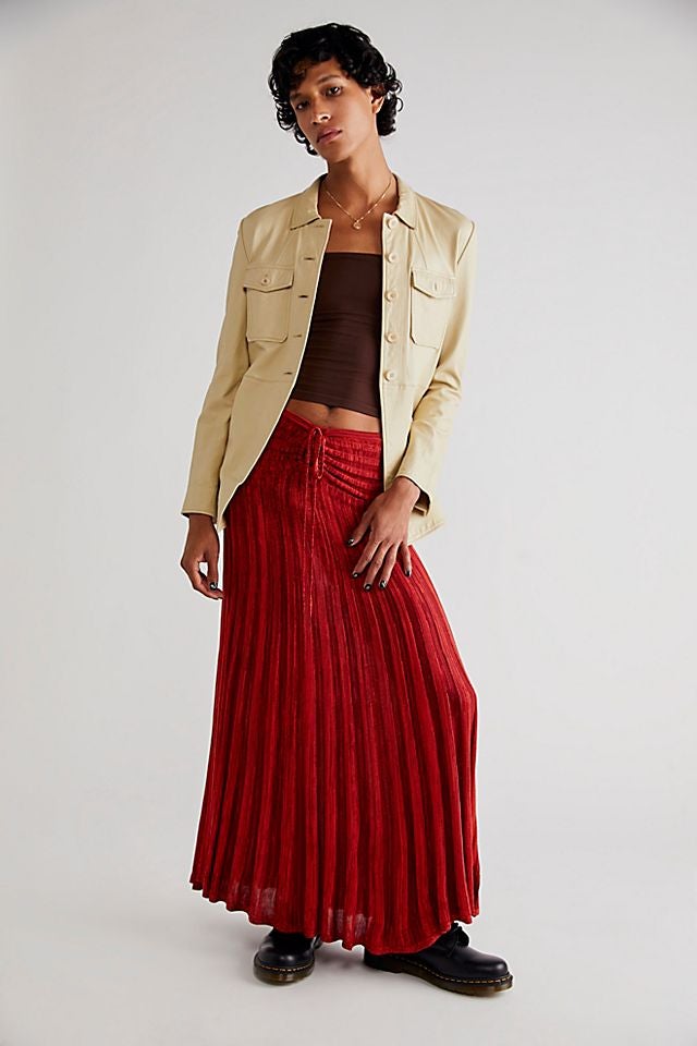
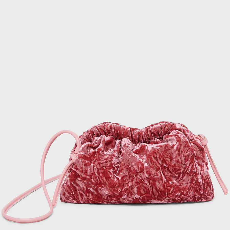
Of course, you can achieve Viva Magenta through other, more insect-friendly means, with textiles created in every color of the rainbow thanks to our modern technology. In the early 20th century, Spanish-born designer Mariano Fortuny created the Delphos gown, a dress that draped across the body subtly and evocatively, inspired by ancient Greek garments. While it came in several shades, in 1968, it was the carmine version of the signature gown that got the silver screen treatment when Barbra Streisand wore it in Funny Girl. While the likes of Viva Magenta shine on silky or iridescent fabrics — like that Fortuny dress, mid-century Yves Saint Laurent gowns, and ‘80s party dresses — the color also goes well with the lushness of velvet and the opulence of satin. It’s a jewel tone, though perhaps a lesser value gem than the others, a tourmaline red rather than a prized ruby. It’s got an underdog charisma, not the va-va-voom red of the femme fatale. It’s softer and quieter, a little moodier, a little less demanding.
AdvertisementADVERTISEMENT
In fashion, these raspberry tones have never been as popular as scarlet or vermillion. Versace famously loved a chili pepper hot shade of red while Supreme has made its mark with clunky blocks of tomato red. While Emilio Pucci enjoyed and often employed a pinkish red in his knitwear and scarves, the reds at Gucci always leaned more Imperial, leathery, and loud. Marc Jacobs has always shown a fondness for tertiary colors, including off-beat purples and brown-tinted teals, and his 2011 collection was rich with cochineal-esque pink. Marni, Rodarte, and Sacai have all recently shown collections featuring magenta, and although Valentino’s collection is far more pink than Pantone’s magenta, the luxury label should get the credit for kicking off the trend that led the way for a rose-tinted takeover.
Pantone prides itself on responding to the zeitgeist, to translating our cultural vibe shifts into swatches of pigment and blocks of pixels. As such, over the past few years, the company has attempted to match its color forecasting to the chaos and sorrow of a pandemic-ravaged planet. In 2021, the two-toned selection — flat gray paired with highlighter yellow — appeared muddled and uninspired, much like how we felt after a year indoors. Last year, Pantone selected Very Peri, an uncertain but cautiously optimistic purply-blue, to match the melancholy mood of 2022.
According to Eiseman, there was little debate over this year’s color. The team knew that they needed a brighter color, something lively and warm. The Pantone representatives I talked to stressed the exuberance, lightness, and “fun” of the color, as well as its androgynous applications. While I would hesitate to call Viva Magenta entirely gender-neutral, it’s not saddled with too many pieces of cultural baggage. It’s an expressive color that draws the eye, and perhaps Pantone chose it because it felt like just the right amount of wild. Bright, but not bloody, pretty but not overly feminine or shockingly sexy, warm but definitely not hot. Pantone also described the 2023 choice as a “nuanced color,” more complicated than some of their previous selections, like the Classic Blue of 2020.
AdvertisementADVERTISEMENT
My strongest association with Viva Magenta is, I must admit, personal and perhaps not very relatable: that of seeing the Northern Lights for the very first time. With my neck craned back, I stared up from the frozen ground and into the Arctic sky, where green and white lights shimmered and danced. It was majestic, beautiful, moving. Yet I had expected more — purples, pinks, violets, fuchsias that I had seen in photographic depictions of the aurora. After I expressed this thought, a photographer friend and travel companion let me see the light show through his camera screen. Where my eye only picked up green and white, his lens was able to capture all these other colors, including those fugitive rays of magenta.
Photo: Richard Bord/Getty Images.
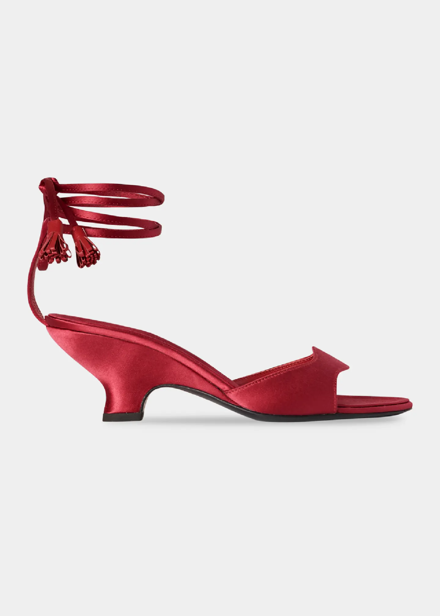
I have no doubt that I will, at some point in 2023, find myself purchasing a Viva Magenta product. (I hope it’s these shoes by The Row, though I am guessing it will be something much more affordable.) I’m looking forward to wearing around the honored hue and thinking about how funny it is that light plays such tricks. Like my Frog Prince, colors change and shift in our perception. Sometimes we’ll see red, other times we’ll get pink. That’s perhaps a good way to look at the coming year: an unknown time, shaded with both promise and risk.
At Refinery29, we’re here to help you navigate this overwhelming world of stuff. All of our market picks are independently selected and curated by the editorial team. If you buy something we link to on our site, Refinery29 may earn commission.
AdvertisementADVERTISEMENT