A Case For Whimsy: How Ellen Van Dusen Is Rewriting The Rules of Home Design
In Ellen Van Dusen’s New York, nothing is rigid or gloomy. No one is bored or mean-spirited. There’s not one swatch of monochrome black to be found.
On the contrary, Van Dusen’s New York comes ornamented in a primary yellow. It’s whimsy, manifest; a veritable fruit salad of colliding colors and shapes. It’s an eternal day party in a children’s zoo, but for grown ups. “I live in my own dream house in the world’s greatest city” says the Bed Stuy-based textile and home goods designer. “Why would I ever leave New York?” If you lived in her brownstone, you might feel the same.
AdvertisementADVERTISEMENT
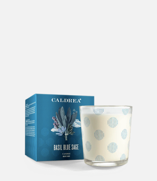
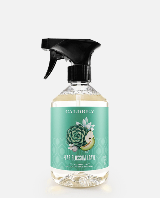
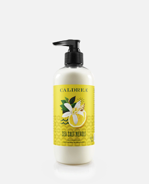
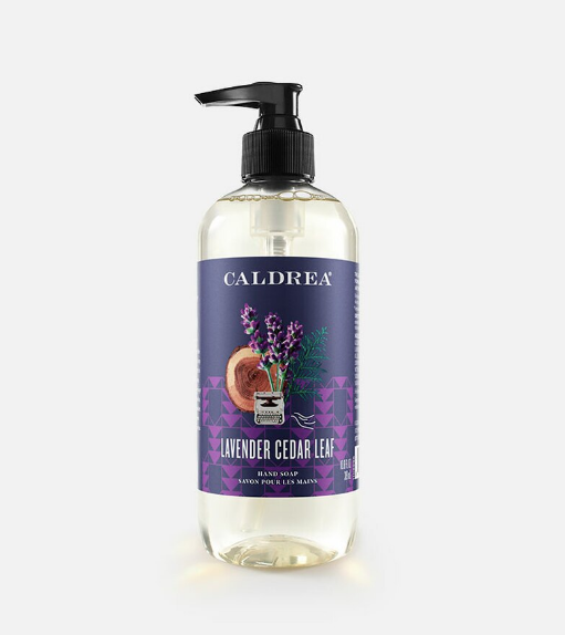
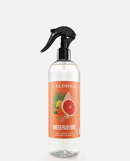
Van Dusen’s clothing and homeware label, eponymously named Dusen Dusen, could be described as an act of rebellion against minimalism. Her pieces, which range from towel sets and duvet covers to loungewear and geometric puzzles, are an homage to the power clash — marked by intersecting stripes and loud, mismatched colors. And her home, a glorious hodgepodge of custom tiling, statement vintage decor, and loud Caldrea product arrays, follows suit. “I never really understood why all the fun colors were designated for children’s products,” she says. “Color is so good for our brains, it makes us happy.”
She’s not exactly speaking off the cuff, here: As a college student, she built her thesis around neuroscience and color theory, examining the ways we perceive color in the brain, and in turn, why that draws us towards specific works of art. According to her research, for millennia, ancient cultures have been practicing forms of “chromotherapy” — and while there are no hard and fast rules around the color-mood-relationship (being that plenty of us will perceive color differently), it has been proven that color at large can impact our moods.
The child of two architects, Van Dusen grew up in Washington D.C. in a home where nearly every room was painted a different color — so it came as no surprise when she decided to study neuro-visual stimuli. “I’ve always gravitated towards really bright colors and I wanted to understand why that was,” Van Dusen explains. “So once I started designing, that color philosophy became the guiding principle behind what I was making. I wanted to incorporate the colors that brought me joy, without reservation.”
AdvertisementADVERTISEMENT
Van Dusen’s first foray into the design world, however, was not via decor. Fresh out of college, she moved to New York City, where she held internships under a shiny roster of capital-F Fashion designers (think: Norma Kamali, Jill Stuart, and Proenza Schouler) before launching her own clothing label — also named Dusen Dusen — at age 22. You may recall the dazzling yellow get-ups donned by Greta Gerwig’s entourage of five at the 2018 Oscars ceremony? Yeah, those were Dusen Dusen.
“
I was really tired of looking at the same minimalist arrangement of white things.
”
After five years spent in the fashion space, she began to clock a recurring dilemma: The world of home textiles was markedly boring. It seemed that the fashion world had made space for a new version of maximalism, but home decor hadn’t yet taken the plunge. “I wanted to upgrade my bedding and my towels and I couldn’t find anything I liked out there in the world — like at all,” she says. “I was looking for printed bedding in particular — something loud and fun like I had when I was growing up.”
The answer became obvious: She would design textiles herself. “After working with clothes for so many years, I realized that my favorite thing about making garments was designing the prints,” she explains. “At the time, I had just moved into a new place, and I was really tired of looking at the same minimalist arrangement of white things.”
Today, you’ll find Dusen Dusen’s signature pinstriped towels everywhere from upscale modern home retailer Design Within Reach to department store chain Nordstrom to hip boutiques like Coming Soon in NYC’s Chinatown. And as the brand’s success continues to mount, Van Dusen’s guiding impulse remains the same: Color breeds joy. Use it, unabashedly.
AdvertisementADVERTISEMENT
“I’m sort of in a green phase. But when I was designing my house, I was in a yellow phase,” she explains of her current brownstone — which she’s spent the past three years curating precisely to her liking. “It’s maybe my all-time favorite color — I still love yellow. I have a yellow front door, a yellow stove, a yellow chair in my kitchen. Right now especially, it helps to make up for the lack of vitamin D.”
For all of us, it’s been a year of interiors. The more time we spend indoors — waiting out shelter-in-place mandates, working remotely, socializing via Zoom calls — the more discerning we’re becoming about our decor. “I’m very particular about my stuff, but still, I constantly look around and think about what changes I could be making," Van Dusen says.
For her, “home” is never a finished project. And that’s neither taxing nor daunting — it’s exhilarating. As she sees it, there’s a thrill in the continual unfolding of a vision within the context of your own space. Be it a matter of introducing ever-louder prints, or trading an old scented candle for a new olfactory experience, it's the perpetual updates that keep her home abuzz with energy. “It’s a nice thing to be eternally engaged in the project of designing something you care about — and a space, in particular, that you live in,” she says.
“
It’s a nice thing to be eternally engaged in the project of designing something you care about — and a space, in particular, that you live in.
”
Her most recent home upgrade took place in her downstairs bathroom — which she calls “the powder room.” Inside, the walls are spotted with handmade illustrations painted by close friend Lorien Stern. “She covered all the walls with these special little characters,” Van Dusen explains. In her upstairs bathroom, on the other hand, a chessboard of black and white tiles clash brilliantly with signature Dusen Dusen towels in a square, geometric pattern reminiscent of a traffic jam, all offset by a row of vibrant Caldrea products lending staccato splashes of color — and an equally lively slew of scents — to the room. The effect is somewhat mesmerizing: Here, the deeply unsexy act of, say, washing your hands becomes a whimsical, sensory experience.
AdvertisementADVERTISEMENT
One flight down, on the brownstone's ground floor, the piece d' resistance is an original fireplace ornamented in bits of broken ceramic tile Van Dusen cemented into place, herself — and the patchwork collage of pieces, like everything in her line, feels nonsensically perfect. Next up, she intends to tackle the backyard: “I can just picture it,” she explains. “The entire thing covered in broken tile in this weird, magic mosaic.”
Walking through Van Dusen’s home is like traipsing through a 3-D rendering of a children’s book. It’s a testament to the bliss that accompanies abandoning minimalism in favor of personality — from the custom kitchen cabinet detailing and the hand-carved eyeball doorknobs, to her living room shelf, Macgyvered by a friend to “suck” her TV out of sight when not in use. “It’s important to have stuff around that makes you happy, and for me that’s color and lots of it — but for someone else that might be a bunch of concrete slabs,” she explains. So, rather than chase some grand, glossy design magazine moment, she thinks our spaces should be dressed to mimic the interiors of our own brains. Each touch — be it a question of scented soap, or textured bath towels — should be personal.
“
I always tell people to just think about what’s important to them and how they can manifest that physically in a room.
”
“Over the years, I’ve collected a lot of things I really love from friends and family — those are things that make me feel really uniquely at home,” she says. “So, as far as decorating advice goes, I always tell people to just think about what’s important to them and how they can manifest that physically in a room. Let’s say you love frogs, maybe you should get a frog poster. Maybe you should paint your own frog.”
AdvertisementADVERTISEMENT
Sure, all the clean corners and conservative sand hues of “adulthood” are plenty enticing, but Van Dusen would argue that there’s no rule declaring that, with maturity, comes eggshell paint. “People can be so apprehensive in the decor space to lean into childlike things," she says. "But the reason we even associate fun, exciting colors and prints with childhood is merely that kids are allowed to feel more free in their creative choices.” Perhaps, if we abandoned our fear of exhibiting so-called “juvenile” taste, we might all be a little more capable of accessing the joy of Van Dusen's New York — primary yellow and all.
shop 5 products
AdvertisementADVERTISEMENT


